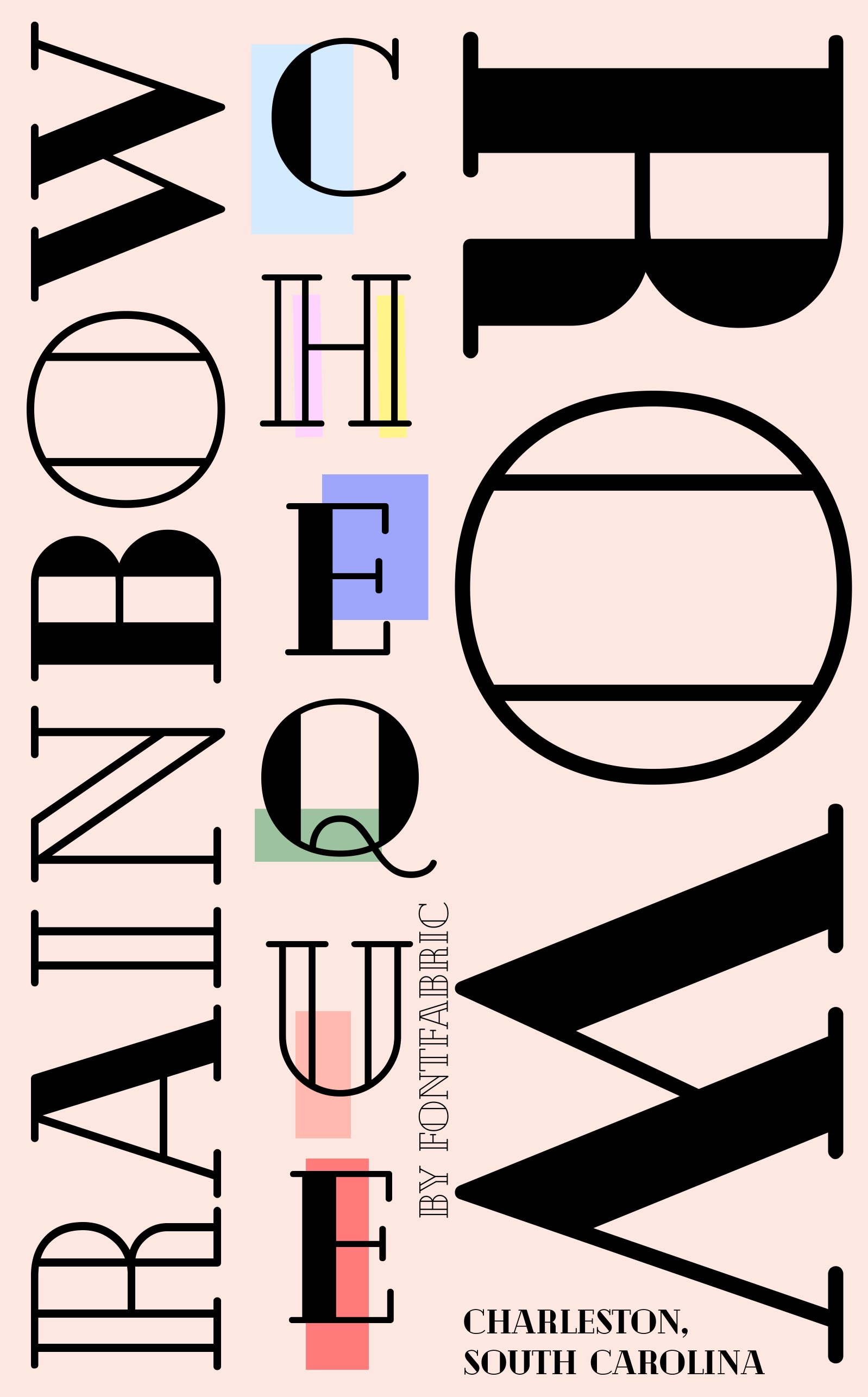
As a project for my Advanced Typography class, I designed a type specimen poster inspired by a place. Traditionally, type specimen posters were sent by companies that designed typefaces to designers as a way to advertise their typefaces through the use of them in these poster designs.
We had to choose a typeface that fits a place and then design a type specimen poster for it related to the place we had chosen. I chose Rainbow Row in Charleston, South Carolina as I really enjoyed visiting it a few years ago. I loved all the pastel colors and the historic southern charm. After some experimentation, I ended up choosing the typeface Cheque.
The front of the poster is focused more on advertising Rainbow Row (Slide 1), while the back contains the typeface in various sizes and arrangements and focuses on advertising the typeface(Slide 2). All of the text used on the back is pulled from descriptions about the houses on rainbow row, and each of the descriptions is in the color of its respective house.